> ## Documentation Index
> Fetch the complete documentation index at: https://docs.mainly.ai/llms.txt
> Use this file to discover all available pages before exploring further.
# Visualizing a Dataset
> This guide teaches you how to load a CSV file from a URL and how to visualize it using Plotly.
[View Project in Designer](https://platform.mainly.ai/designer/projects/16/graphs/43)
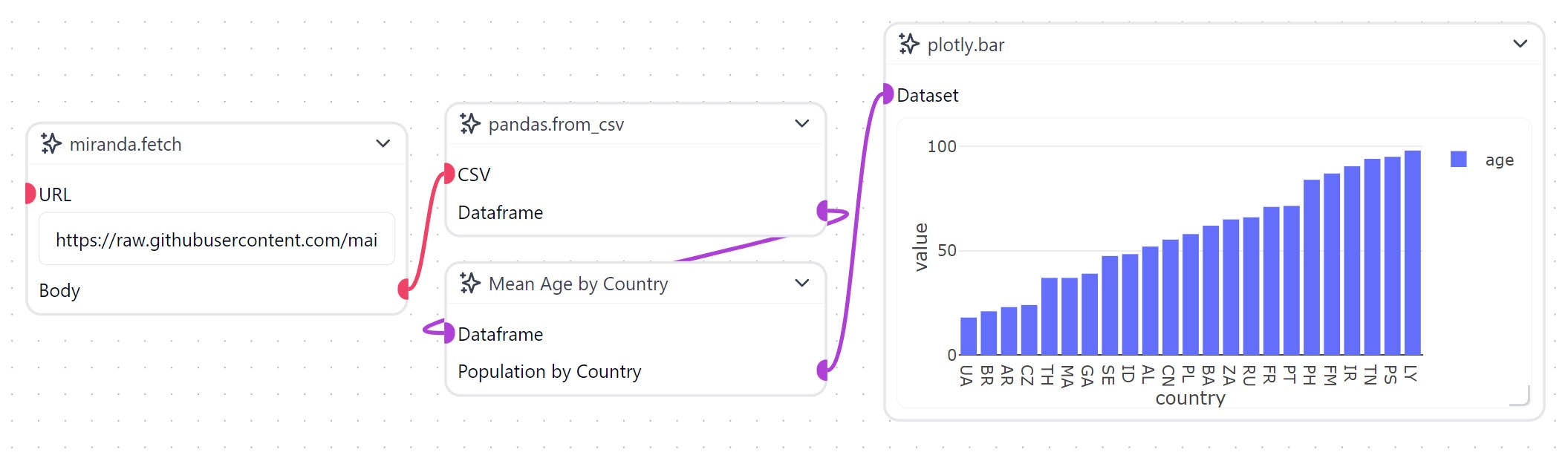 This guide will use three [Prefabs](/workflow_objects#prefabs) and one custom [Workflow Object](/workflow_objects#custom) to load a CSV file from GitHub over HTTP and visualize it as a bar chart using Plotly.
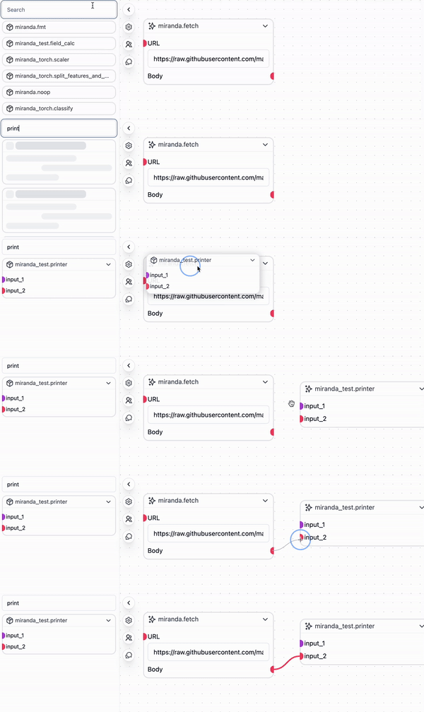
Begin by importing the `net.fetch` Prefab by dragging it from the Prefab Library on the left-hand side of the workspace into the workflow graph.
This guide will use three [Prefabs](/workflow_objects#prefabs) and one custom [Workflow Object](/workflow_objects#custom) to load a CSV file from GitHub over HTTP and visualize it as a bar chart using Plotly.
Begin by importing the `net.fetch` Prefab by dragging it from the Prefab Library on the left-hand side of the workspace into the workflow graph.
 In this example, we will be using a sample dataset of population statistics with the following columns:
* `id` - A unique identifier for each row
* `gender` - Possible values are `Male`, `Female`, `Bigender`, `Agender`, and `Genderfluid`.
* `age` - A positive integer
* `country` - A two letter country code
The dataset is available as a CSV file on GitHub at the following URL: [`https://raw.githubusercontent.com/mainly-ai/the-lab/main/datasets/population_stats.csv`](https://raw.githubusercontent.com/mainly-ai/the-lab/main/datasets/population_stats.csv)
Enter this dataset URL into the `URL` field of the `net.fetch` Prefab. Then import the `util.show_text` prefab and connect the `Body` transmitter on the `net.fetch` Prefab to the `input_2` (which takes a String) receiver on the `miranda_test.printer` Prefab.
In this example, we will be using a sample dataset of population statistics with the following columns:
* `id` - A unique identifier for each row
* `gender` - Possible values are `Male`, `Female`, `Bigender`, `Agender`, and `Genderfluid`.
* `age` - A positive integer
* `country` - A two letter country code
The dataset is available as a CSV file on GitHub at the following URL: [`https://raw.githubusercontent.com/mainly-ai/the-lab/main/datasets/population_stats.csv`](https://raw.githubusercontent.com/mainly-ai/the-lab/main/datasets/population_stats.csv)
Enter this dataset URL into the `URL` field of the `net.fetch` Prefab. Then import the `util.show_text` prefab and connect the `Body` transmitter on the `net.fetch` Prefab to the `input_2` (which takes a String) receiver on the `miranda_test.printer` Prefab.
 Now let's run the project and look at the output in the logs using the [Processor](/processor) panel on the right of the workspace.
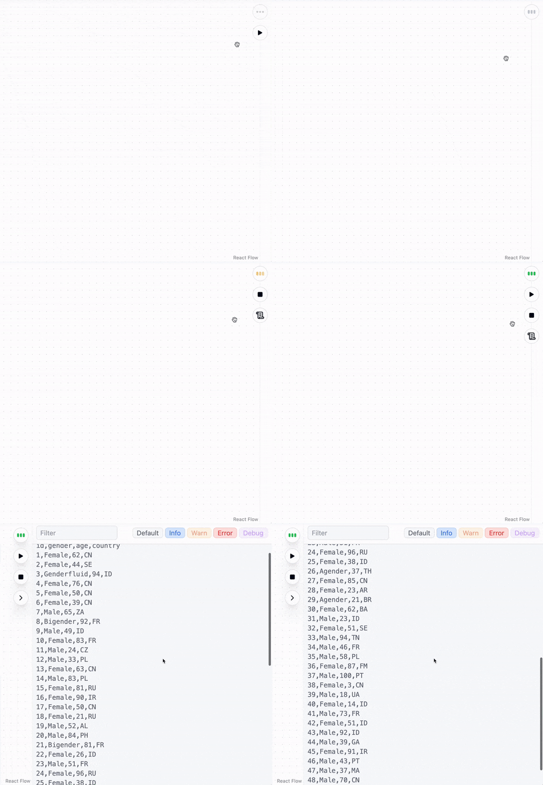 You should now see the text contents of the CSV file in the logs. To visualize this data, we will first need to parse it into a format that Plotly can understand, such as a Pandas DataFrame. To do this, we will use the `pandas.from_csv` Prefab. Import it from the Prefab Library and connect the `Body` transmitter on the `net.fetch` Prefab to the `CSV` receiver on the `pandas.from_csv` Prefab. Then you can connect the `Dataframe` transmitter on the `pandas.from_csv` Prefab to the `input_1` (which takes a Dataframe) receiver on the `miranda_test.printer` Prefab.
However, if we try to plot this data directly using Plotly, we will get an error or incoherent results. This is because the data is high-dimensional. Let's write a custom [Workflow Object (Node)](/workflow_objects#custom) to aggregate the data and visualize it as a bar chart. In this example, we will group the data by `country` and average the `age` column.
Create a new Node by right-clicking on the workspace and selecting `Create Node`. Then right-click the node and select `Edit Code` to begin implementing our own logic. By default, the new Node contains some boilerplate code to get you started.
```python theme={null}
from mirmod import miranda
@wob.init()
def init(self):
self.value = None
@wob.receiver("value","input")
def receive_value(self, value):
self.value = value
@wob.transmitter("value", "output")
def transmit_value(self):
return self.value
@wob.execute()
def execute(self):
print(f"self.value = '{self.value}'")
```
These are the four main parts of a Workflow Object, which are evaluated in the following order:
1. `init` - This is the constructor for the Workflow Object. It is called when the object is created and can be used to initialize any variables.
2. `receiver` - Receives data from other Workflow Objects or from Controls.
3. `execute` - This is the main function of the Workflow Object. It is called when all the receivers have been called.
4. `transmitter` - Sends data to other Workflow Objects.
Let's initialize our Workflow Object. We're gonna want two variables, `self.df` to store the DataFrame received from the `pandas.from_csv` Prefab and `self.transformed` to store the transformed DataFrame.
```python theme={null}
@wob.init()
def init(self):
self.df = None
self.transformed = None
```
The default code is configured to receive and transmit strings. We will need to modify this to use DataFrames. Let's also change the names to better reflect the purpose of the Node and make sure we're setting and returning the right variables.
```python theme={null}
@wob.receiver("data", "Dataframe")
def receive_value(self, value):
self.df = value
@wob.transmitter("data", "Population by Country")
def transmit_value(self):
return self.transformed
```
Now let's write the logic to transform the DataFrame. We will use the `groupby` method to group the data by `country` and then use the `mean` method to average the `age` column.
```python theme={null}
@wob.execute()
def execute(self):
self.transformed = self.df.groupby(['country'])['age'].mean().sort_values()
```
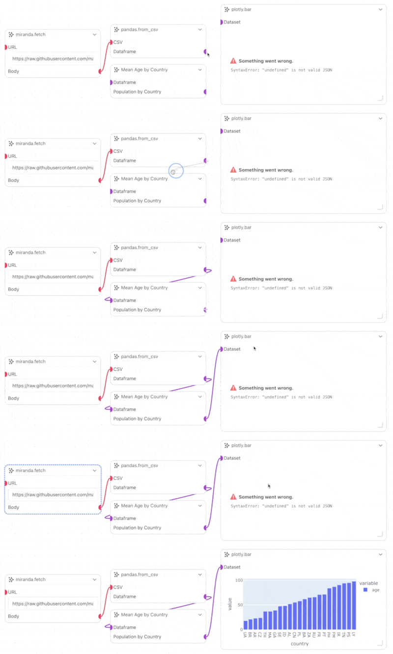
Now lets plot this data using Plotly. Import the `plotly.bar` Prefab and connect the `Population by Country` transmitter on the custom Workflow Object to the `Dataset` receiver on the `plotly.bar` Prefab. Then run the project, and you should see a bar chart of the average age by country appear on the `plotly.bar` node.
You should now see the text contents of the CSV file in the logs. To visualize this data, we will first need to parse it into a format that Plotly can understand, such as a Pandas DataFrame. To do this, we will use the `pandas.from_csv` Prefab. Import it from the Prefab Library and connect the `Body` transmitter on the `net.fetch` Prefab to the `CSV` receiver on the `pandas.from_csv` Prefab. Then you can connect the `Dataframe` transmitter on the `pandas.from_csv` Prefab to the `input_1` (which takes a Dataframe) receiver on the `miranda_test.printer` Prefab.
However, if we try to plot this data directly using Plotly, we will get an error or incoherent results. This is because the data is high-dimensional. Let's write a custom [Workflow Object (Node)](/workflow_objects#custom) to aggregate the data and visualize it as a bar chart. In this example, we will group the data by `country` and average the `age` column.
Create a new Node by right-clicking on the workspace and selecting `Create Node`. Then right-click the node and select `Edit Code` to begin implementing our own logic. By default, the new Node contains some boilerplate code to get you started.
```python theme={null}
from mirmod import miranda
@wob.init()
def init(self):
self.value = None
@wob.receiver("value","input")
def receive_value(self, value):
self.value = value
@wob.transmitter("value", "output")
def transmit_value(self):
return self.value
@wob.execute()
def execute(self):
print(f"self.value = '{self.value}'")
```
These are the four main parts of a Workflow Object, which are evaluated in the following order:
1. `init` - This is the constructor for the Workflow Object. It is called when the object is created and can be used to initialize any variables.
2. `receiver` - Receives data from other Workflow Objects or from Controls.
3. `execute` - This is the main function of the Workflow Object. It is called when all the receivers have been called.
4. `transmitter` - Sends data to other Workflow Objects.
Let's initialize our Workflow Object. We're gonna want two variables, `self.df` to store the DataFrame received from the `pandas.from_csv` Prefab and `self.transformed` to store the transformed DataFrame.
```python theme={null}
@wob.init()
def init(self):
self.df = None
self.transformed = None
```
The default code is configured to receive and transmit strings. We will need to modify this to use DataFrames. Let's also change the names to better reflect the purpose of the Node and make sure we're setting and returning the right variables.
```python theme={null}
@wob.receiver("data", "Dataframe")
def receive_value(self, value):
self.df = value
@wob.transmitter("data", "Population by Country")
def transmit_value(self):
return self.transformed
```
Now let's write the logic to transform the DataFrame. We will use the `groupby` method to group the data by `country` and then use the `mean` method to average the `age` column.
```python theme={null}
@wob.execute()
def execute(self):
self.transformed = self.df.groupby(['country'])['age'].mean().sort_values()
```
Now lets plot this data using Plotly. Import the `plotly.bar` Prefab and connect the `Population by Country` transmitter on the custom Workflow Object to the `Dataset` receiver on the `plotly.bar` Prefab. Then run the project, and you should see a bar chart of the average age by country appear on the `plotly.bar` node.