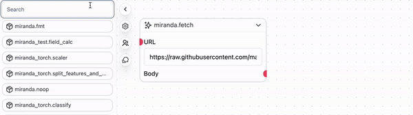
net.fetch Prefab by dragging it from the Prefab Library on the left-hand side of the workspace into the workflow graph.

id- A unique identifier for each rowgender- Possible values areMale,Female,Bigender,Agender, andGenderfluid.age- A positive integercountry- A two letter country code
https://raw.githubusercontent.com/mainly-ai/the-lab/main/datasets/population_stats.csv
Enter this dataset URL into the URL field of the net.fetch Prefab. Then import the util.show_text prefab and connect the Body transmitter on the net.fetch Prefab to the input_2 (which takes a String) receiver on the miranda_test.printer Prefab.
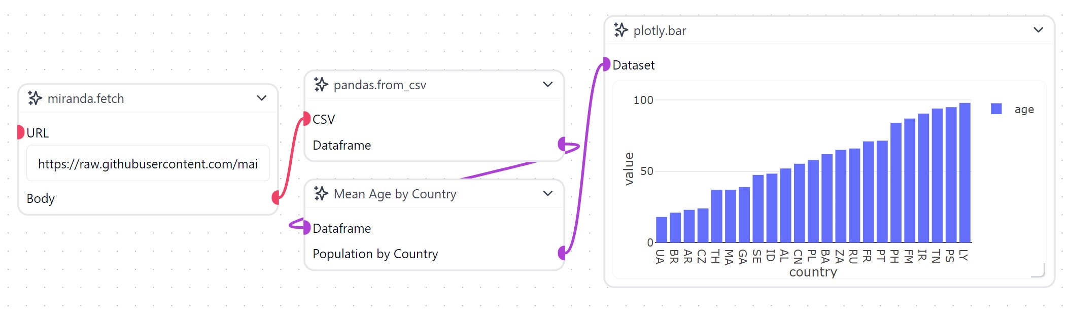
pandas.from_csv Prefab. Import it from the Prefab Library and connect the Body transmitter on the net.fetch Prefab to the CSV receiver on the pandas.from_csv Prefab. Then you can connect the Dataframe transmitter on the pandas.from_csv Prefab to the input_1 (which takes a Dataframe) receiver on the miranda_test.printer Prefab.
However, if we try to plot this data directly using Plotly, we will get an error or incoherent results. This is because the data is high-dimensional. Let’s write a custom Workflow Object (Node) to aggregate the data and visualize it as a bar chart. In this example, we will group the data by country and average the age column.
Create a new Node by right-clicking on the workspace and selecting Create Node. Then right-click the node and select Edit Code to begin implementing our own logic. By default, the new Node contains some boilerplate code to get you started.
init- This is the constructor for the Workflow Object. It is called when the object is created and can be used to initialize any variables.receiver- Receives data from other Workflow Objects or from Controls.execute- This is the main function of the Workflow Object. It is called when all the receivers have been called.transmitter- Sends data to other Workflow Objects.
self.df to store the DataFrame received from the pandas.from_csv Prefab and self.transformed to store the transformed DataFrame.
groupby method to group the data by country and then use the mean method to average the age column.
plotly.bar Prefab and connect the Population by Country transmitter on the custom Workflow Object to the Dataset receiver on the plotly.bar Prefab. Then run the project, and you should see a bar chart of the average age by country appear on the plotly.bar node.